
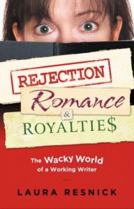
 Laura Resnick has authored 6 fantasy-detective-comedy novels (the Esther Diamond series from Daw), 3 fantasy novels (the Silerian trilogy from Tor), 15 romance novels (from Silhouette), many short stories (mostly in DAW anthologies), several essays on print and screen fiction, and “Rejection, Romance, and Royalties: The Wacky World of a Working Writer.”
She won the Campbell award for best writer and was a finalist for the Rita award. She won the Romantic Times Magazine award 3 times. She writes “The Mad Scribbler,” a monthly opinion column for Nink. For the Science Fiction & Fantasy Writers of America’s bulletin, she wrote a quarterly opinion column, “The Filthy Pro.” She wrote a monthly column, “The Comely Curmedgeon,” for Nink. She has served as member of the board of directors, president elect, and president of Novelists, Inc.
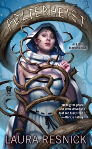
Laura Resnick has done extensive research, including interviews with authors and art directors, on how cover art is developed and how it has a drastic affect on sales and careers. Her current artist, for the Esther Diamond series, is Dan Dos Santos, a 5 time Hugo nominee and Chesley winner.
In this interview with Diabolical Plots‘ Carl Slaughter, she provides the inside story on cover art.
CARL SLAUGHTER: You’ve done extensive research on how cover art affects sales figures and author careers. Give us some examples of cover art that tanked sales and delayed careers and some examples of how cover art moved a book off the shelf and fast tracked a career.
 LAURA RESNICK: An editor once cited Barbara Michaels aka Elizabeth Peters to me as an example of a writer whose career was held back for years by bad covers. Peters died last year (peacefully at home, at the age of 85) after a career which included many New York Times bestselling novels. But that success came some 20 years and many well-reviewed books into her career, and there was a noticeable shift in packaging that accompanied her well-deserved success. For years, publishers were giving her muddy, generic covers that conveyed nothing of the tone of her books, and she developed her audience strictly on her own merits via word-of-mouth, with no help at all from her dreadful packaging. Then if you look at the packaging she started getting around the mid-1990s, you can see a definite shift in quality of the covers, which accompanied her rising sales. In particular, the eventual packaging of her Amelia Peabody series (the early books, poorly packaged, were also repackaged with the new look) was a winner, and the series was commercially very successful for years (she was working on another Amelia Peabody book when she died).
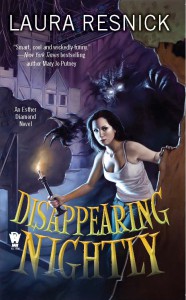
In my own case, my Esther Diamond series had a disastrous launch with (among other problems) a hideously inappropriate cover from Luna Books. Esther Diamond is a comedic urban fantasy series. To give you some idea of how off-target that cover for book #1, Disappearing Nightly, was: The year that book was released, I held that cover up for an audience at a workshop on book covers and packaging, and I asked them what kind of book they thought this cover was for. The two audience members who got the most agreement form everyone else? One thought it was a 1970s showbiz memoir, and the other thought it was a thriller about a hooker. When no one looking at an Esther Diamond cover can tell that it’s (1) urban fantasy, (2) comedy, or (3) a series, that represents a very serious cover problem. The book tanked and Luna dumped me (and so did my fourth literary agent,don’t even get me started on agents). Fortunately, DAW Books was willing to take a chance on book #2 of this badly mishandled series. They packaged it wonderfully, revived the series, subsequently acquired and repackaged book #1, we’re about to release book #7, and I’m contracted through at least book #10,of a series that crashed and got dumped after one book because of disastrous packaging at its previous house.
I think Charlaine Harris (author of the Sookie Stackhouse novels, aka the “Trueblood” series) is an example of someone who got a boost from good packaging. Harris was a longtime midlist career writer who developed the idea for the Sookie Stackhouse novels in an attempt to use her strengths as a writer to achieve the commercial success which had so far eluded her. (Obviously, she succeeded, becoming a #1 hardcover NYT bestseller with this series.) Ace Books launched the first book in the series, Dead Until Dark, with a very distinctive cover. I remember picking up that book years ago because of the cover (which was impressive packaging, since I don’t read vampire novels). Harris was doing good work on a very commercial project, but the distinctive packaging really helped that series stand out early on.
CARL: Who makes decisions about cover art and who should be making those decisions?
 LAURA: At large publishing conglomerates (ex. Hachette, HarperCollins, Penguin Random House, MacMillan, and Simon & Schuster), too often the people making decisions about packaging are unfamiliar with the book or the author’s work,and therefore also unfamiliar with the author’s audience, who are the people the cover needs to attract. I have even been told anecdotes by wearily amused art directors about book covers being directed by senior people in the corporate hierarchy who don’t read books and who have no art or design background whatsoever, but who, for one reason or another, want cover control. To give just one example of how truly absurd the process can get, one art director at a major house told me that for a year or two, most of that company’s major releases had red covers because the Chief Financial Officer’s girlfriend liked red, and he wanted to make her happy.
Meanwhile, at the other end of the spectrum, depending on just how small a small press is, art direction may be in the hands of one person who is also editor, marketer, publisher, and business manager. This can go well if that person is brilliant at art direction,and badly if he’s not.
Ideally, what you want in your cover artist/illustrator, designer, and/or art director are people who know art and design, know the book or the author’s work, and understand what look attracts the author’s audience. Art directors and cover artists have told me that the more people that get involved in the process, the harder it is to come out of the maelstrom with a good cover. It’s a basic “too many cooks spoil the broth” issue,especially if most of those people don’t know the book and don’t know design.
Which is not to say, however, that no one else’s input is ever valuable. One senior editor who was directing her own imprint, for example, told me about an instance where someone on the publisher’s sales force contacted her to object to a cover, and his advice was probably career-saving for the author (he had good reason to believe that a major retail chain would refuse to carry that cover, and so the package was rethought). On the other hand, the same editor also had numerous incidents of sales reps emphatically offering cover advice on the basis of what would appeal to them,rather than (and in direct opposition to) what would appeal to the audience whom the books in her imprint were aimed at.
CS: Are art directors qualified to make decisions about marketing? Are authors qualified to make decisions about art?
 LR: Well, “marketing” is a broad term, involving a lot of areas unrelated to the book cover. It is, in essence, the question of how to get lots of people who are likely to enjoy the book to pick it up in the first place.
For the past few decades, book covers (and everything else in the publishing process) tended to be aimed at middlemen,distributors and retailers,rather than at readers. Booksellers, distributors, and head buyers for the major chains are publishers’ customers (particularly big conglomerate publishers). So decisions about manuscript acquisition and cover design have tended to be made with those type of businesses in mind. eBooks and internet shopping are now affecting this process by eliminating some of those layers and elevating the importance of the reader’s reaction to a book cover. Additionally, covers online have to catch the reader’s eye in a much smaller format (thumbnail size, rather than physical book size), which is also affecting design decisions. So the cover world, like the entire book world, is in flux these days.
That said, an art director can package a book brilliantly if she’s a brilliant art director for books, and she can only do a mediocre or poor job if she’s mediocre or poor at packaging books. Additionally, any art director is packaging a lot of books every year, on a tight schedule,and no one is brilliant all the time, for every book, especially when she has limited time to work on it; this is why even companies with mostly good covers nonetheless release some frogs-and-dogs every year.
Authors have typically been omitted from participation in the traditional book cover process at most publishing houses. This is an example of the dismissive contempt that most publishers exercise toward writers, who are usually treated as something between a tedious encumbrance and a mutant sewer rat.
Admittedly, in some cases. omitting the author from the cover process is understandable. There are authors who fixate on irrelevancies (the heroine’s hairstyle isn’t right; the hero is too muscular; the dragon doesn’t really look like that; etc.) or who have One Sole Idea for the cover and are angry at any deviation from it (even if the idea is unworkable or just plain bad).
A book cover is supposed to be an effective advertisement for your book, not a perfectly detailed representation of a scene exactly as it appeared in the author’s head. An author can only be productive in the cover process if she understands that and acts accordingly.
That said, the function of the book cover is to attract the author’s audience (her existing readers and readers who’ll like her work if they can be convinced to pick up and open the book),and who knows the author’s audience better than the author herself, for goodness sake? She is the person who is attracting that audience with her stories, book after book,not some random bystander who has no idea what her audience is interested in! She probably also is her audience, since most writers are writing books they’d like to read.
There are authors who don’t want to be involved in the cover process (though they are increasingly rare). But any author who wants to be involved should be given that chance (and at most publishing houses, is still not allowed that opportunity), because she understands her audience better than anyone else in the publishing process.
CS: How can an author get involved in the art process and ensure their books get good covers – or at least don’t get bad covers – without alienating relationships at the publisher?
 LR: Not alienating relationships at the publishing house is a matter of professionalism in all things, not just covers. And, frankly, I’ve worked with a couple of publishers in the past which are so unprofessional and so contemptuous of authors that there’s really no way to get anything done without alienating them. (Also, in retrospect, I don’t regret the instances where I alienated publishing staff in order to protect my books. I regret the few instances where I foolishly backed off on protecting my books in order to try to preserve relationships with publishers; this turned out to be the wrong decision in every instance. When a book is handled badly, sales suffer, and so the relationship is destroyed anyhow,because publishers publish for money, not love, friendship, loyalty, or honor.)
In terms of the cover process, some general practical tips for writers: Inform your editor at the start (and with occasional reminders along the way) that you want to be involved in the cover process. (If you’ve done this before, present examples, so that they can see you actually wind up with good covers when you’re involved.)
Present a shortlist of cover artists (3-6) as suggestions for your cover art; and ask the editor who the publisher is thinking of. Try to establish a dialogue about who will do the cover, because getting the right artist will eliminate a lot of potential problems.
If they’re going to bypass art and go strictly with design (or design and stock photos), then present a package (ex. 4-8) of sample covers that convey the sort of style/tone you think would suit your book, and ask their opinion, feedback, or counter suggestions. They may ignore you but, again, work on establishing a dialogue, on presenting yourself as someone who should be kept in the loop and with whom ideas should be discussed.
Ask to see the artist’s sketches (and you should probably ask fairly often, if it’s a house or editor likely to omit you) or the designer’s early concepts. This is crucial, because this is the stage at which you’ve got the best chance of having your input included,while they’re planning the thing. (Too many writers just wait until they see the final cover and then object; this is way too late to voice an opinion, folks. It’s like saying after the house is built that you’d like the kitchen to be in front, not in back; at that late date, everyone’s just going to ignore you.)
After sketches or concept have been approved, ask to see the preliminary art (an artist will usually do some minor revisions to the art, as requested) or near-final design, which is another stage at which you can make suggestions.
Always be constructive and make suggestions. Just complaining and telling them what you don’t like doesn’t give anyone in the process anything to work with.
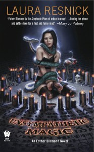
If there’s an artist, give him an e-file or Pinterest link (early on, before sketches) with lots of images. Artists are visual people, so don’t bore him with tons of text, show him visuals. I provide cover artists with all sorts of images that represent the “look” of my books, a visual portrayal of the world that’s inside my head, imagery that’s related to the text, pictures and covers that convey the tone I think would suit my cover, etc. For example, for the cover of Unsympathetic Magic, I sent artist Dan Dos Santos loads of images from my research on Vodou; for The Misfortune Cookie, I sent him the photos I’d taken on my research trips to Chinatown and copies of the Chinese calligraphy I’d been researching for the book. If you don’t have direct connection to the artist, then pass this material to him through your editor,and follow up to make sure the editor gave it to him.
Always remember, the final cover is a done deal. If that’s the first time you’re looking at it, it’s too late to change anything. So get into the process early. (However, if you hate the final cover so much you want to kill yourself, then make some design suggestions; they won’t change art at that late date, but they might change design, which is an easier fix. Might, I say.)
CS: Can authors afford to commission their own art? Should they? Can they find free cover art on the Internet, and if so, should they use it?
 LR: Authors are doing this in the self-publishing world,and in many cases, very effectively and successfully. In the traditional publishing world, though, you don’t want to do this. One, your publisher won’t go along with it; two, why on earth would you sign a contract that funnels the majority of the income to a publisher if they aren’t going to pay for the packaging? If you want to do the packaging yourself, then self-publish. (For some examples of great self-published covers, check out some awards sites for “best of” indie and self-published cover art.)
CS: “The original cover art for your romance novels has lovers in passionate embrace. Later covers have a large heart shape and no people or people silhouetted. Why the big change?”
LR: The romance market changed a lot over time, and is still evolving,as all book markets do. The covers of couples passionately embracing (in which the woman is usually half-naked and the man is mostly shirtless) was a trademark look for the genre that was largely developed by an artist named Pino (an Italian immigrant, classically trained artist, and lovely man who passed away a couple of years ago) and Kensington Books (founded by the late Walter Zacharius). The half-naked babes on the covers were popular with the truckers and jobbers who stocked a lot of the wire-rack outlets where mass market paperbacks where sold 30 years ago, and it was a new, glamorous look that became very successful. However, by the 1990s, cloth covers for these books were very popular with readers, many of whom were uncomfortable being teased or smirked at for reading novels with these prurient covers, and the look was becoming less popular. Meanwhile, the superstore phenomenon (ex. Barnes & Noble) was coming to dominate bookselling, and romance novels needed shelf space in those stores as shopping/buying habits changed among readers. A more “bookstore-ish” look became desirable. So publishers gradually started experimenting with romantic looking covers that still visually identified the genre of the book, but without a semi-clad couple actually fornicating right there on the cover.
Some years after that, though, erotica became a big market. And then ebooks came along, and no one actually sees the cover of the book you’re reading on your e-tablet. These are two factors that have led to a portion of the market moving back toward more sexual covers,while other writers and subgenres in romance have adopted more mainstream looks, images that wouldn’t have appeared on a “romance novel” 20 years ago (ex. A beach chair by the ocean; a cafÃ�’ � table; two hands clasped; etc.) So the whole look of the genre keeps changing as the market continues evolving.
CS: I was captivated by the cover art for your Esther Diamond series. Particularly the cover of “Misfortune Cookie.” So exciting, so intriguing, so dramatic, so vivid. It looks a puzzle with pieces for the reader put together. I count at least 4 hands sticking out of that giant fortune cookie. And Esther is portrayed as being perpetually on the move as she solves the case. The cover of “Unsympathetic Magic” is also particularly eye catching. So who is your cover artist? Because, if I don’t succeed as a writer, I could always kidnap them and make a fortune selling their art!
 LR: The Esther Diamond covers are illustrated by the brilliant Dan Dos Santos. He’s a Chesley Award winner, a five-time Hugo Award nominee, and has won or been nominated for numerous other awards for his art. He’s also prolific, so you’ve probably seen his art on numerous other book covers.
DAW Books publishes the Esther Diamond series, and they’ve been terrific about including me in the cover process. We discussed artists early on, and Dan was top pick for each of us. He’s extremely creative with cover images, very imaginative, and he captures a perfect combination of menace, comedy, and sexiness in these covers. I typically review the cover sketches and the preliminary art with the publisher, and we develop a consensus on the feedback that my editor gives him. Dan also communicates directly with me about various specifics or questions. So the cover process for the Esther Diamond novels is a pleasure for me, rather than an exercise in helplessness and frustration, and the results have been consistently excellent.
CS: “Book #7 in the Esther Diamond series, “Abracadaver,” comes out in November. Any more lined up? Will you continue the series indefinitely?”
LR: There are three more unwritten Esther Diamond novels under contract at this time, and I hope to do many more after that. (I’m currently tearing my hair out trying to come up with a title for book #8.)
CS: Any advice to aspiring writers?
 LR: The market and the book/publishing world have changed a great deal during the years I’ve been writing professionally, yet I find that the two most common mistakes that aspiring writers make have not changed at all: not writing enough and not educating themselves about the business. And so my advice hasn’t changed, either. It’s still:
1. Write a lot. Practice your craft. Keep writing. And write still more after that. This is a craft, not divinely-inspired magic. It requires practice. Genius does not automatically flow forth from your muse-blessed fingertips. If you don’t expect to play a sonata perfectly the first time you ever sit down at a piano, then why would you expect to write an excellent story or novel the first time you sit down to write one? Talent is wildly romanticized and overrated, and the unglamorous qualities of plain old hard work and perseverance are perpetually underrated.
2. Educate yourself about the writing/publishing business and keep educating yourself. This is a competitive profession and a complex industry. You need to treat it as such if you want to succeed.
CHECK OUT LAURA RESNICK’S ESSAY ON COVER ART:
http://www.sff.net/people/laresnick/About%20Writing/Book%20Covers.htm
CHECK OUT LAURA RESNICK’S ESSAYS ON LITERARY AGENTS:
http://www.sff.net/people/laresnick/Excerpts/RWRexcerp.htm
http://www.ninc.com/blog/index.php/archives/author-agent-business-model
CHECK OUT LAURA RESNICK’S TESTIMONY ON BREAKING INTO WRITING::
READ EXCERPTS OF LAURA RESNICK’S ESTHER DIAMOND SERIES::
http://www.sff.net/people/laresnick/Excerpts/ManMattExcerp.htm#MCexcerpt
http://www.sff.net/people/laresnick/Excerpts/UnsympMag.htm#Polterheist
http://www.sff.net/people/laresnick/Excerpts/Doppel.htm
LAURA RESNICK’S NONFICTION WRITING::
http://www.sff.net/people/laresnick/Other%20Writing/NonFic.htm
LAURA RESNICK’S HOME PAGE::
 Carl Slaughter is a man of the world. For the last decade, he has traveled the globe as an ESL teacher in 17 countries on 3 continents, collecting souvenir paintings from China, Korea, Thailand, Vietnam, and Egypt, as well as dresses from Egypt, and masks from Kenya, along the way. He spends a ridiculous amount of time and an alarming amount of money in bookstores. He has a large ESL book review website, an exhaustive FAQ about teaching English in China, and a collection of 75 English language newspapers from 15 countries.