
written by David Steffen
There’s been a lot of work going on behind the scenes at the Submission Grinder site in preparation for a big site upgrade.
ETA: The upgraded version is now on the main site. See the rest of this article for a list of some new features.
What you’re seeing is an overhaul of the site that’s been in the works for quite some time now. The new site includes all the features you’re familiar with, plus some exciting new ones. I’ve written this article to show off some of the new changes. As always, the site is free to use whether you register an account or not. I encourage you to go check out the new site for yourself, or for the first time if you’re a newcomer to the site.
Now that this big batch of features is rolled out, it should be much easier for me to roll out individual features as they are ready to launch. I have a lot of ideas that I think you’re all going to love; it’s just a matter of prioritizing them and finishing them one by one.
First, I want to thank a few people who have contributed to this new development.
- First and foremost, thank you to Anthony Sullivan who wrote most of the code. You may remember that Anthony had co-edited Diabolical Plots with me for a number of years, and we collaborated to launch the Submission Grinder site in 2013. He wrote the entire original site in a very short period of time, as well as the majority of the feature updates to that version of the site over the last 3+ years. He also wrote most of the new version of the site, before he changed the focus of his work. Anthony is still around and contributing to the site to help with hosting and mentoring me as I learn more about web development. If you want to find out what he’s doing, you can check out his website, where he’s been working on video game development, at Zombie Possum.
- Thank you to Stewart C. Baker and Matt Dovey, for your immense help with the CSS work to make the site much more friendly to mobile devices. I have very little experience with CSS, and it’s incredible to see what someone more knowledgeable than me can do to make the site much more usable. (There is still some work to be done yet to make the site entirely mobile friendly! But the parts that are mobile friendly are because of their excellent work)
- Thank you to the beta testers who volunteered to pound out as many dents as possible on this site before it became the new official site, and for meticulously spelling out what you found so that I could track down and resolve those issues.
- And thank you to all the users, especially those who donate, spread the word about the Grinder, suggest new features, suggest market updates, or help contribute to the effort in any other way.
Okay, now that all the sappy stuff is out of the way, let’s get to the new features! These are listed in approximate order of how excited I am about the feature, with the most exciting features first. (YMMV so of course it’s possible that you’re more excited about the last ones on the list, so this is far from a scientific sorting method)
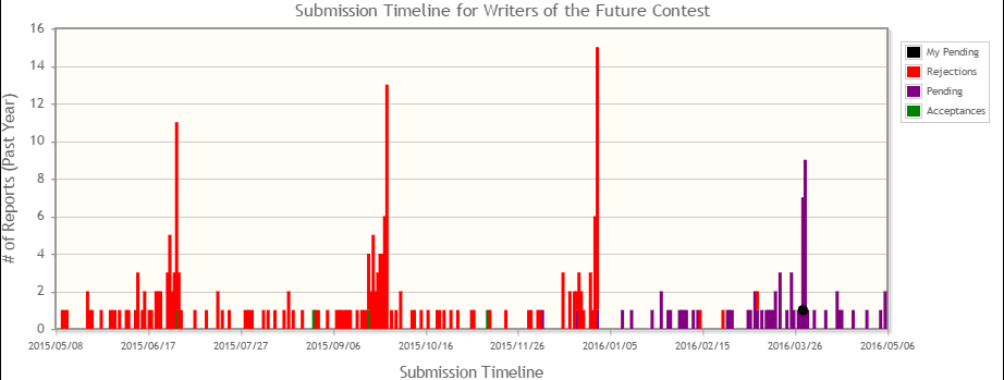
Submission Timeline Graph
This is a feature I’ve been so eager to share with more people because it shares an incredible amount of information in a very compact space.
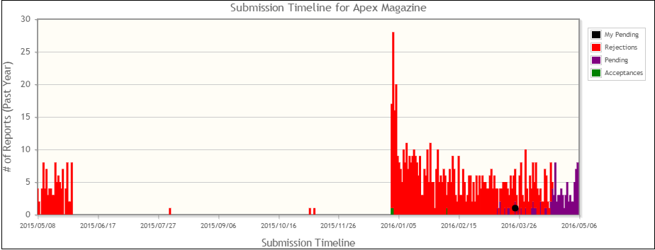
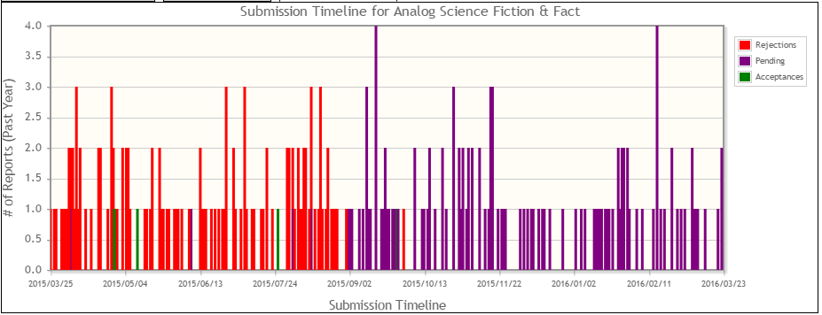
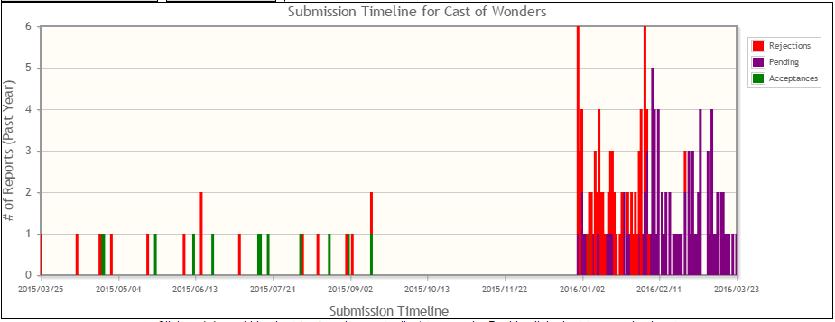
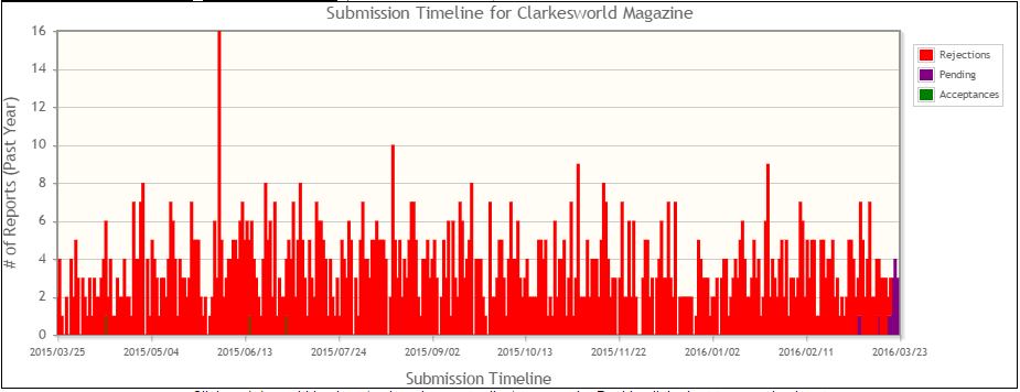
The graph is a bar chart. The X axis is time, covering dates between one year ago and today. The height of the bars is the number of recorded submissions sent to that market on that day. Bars representing submissions that have met different ends are stacked on top of each other–purple bars are pending response, red bars are rejections, green bars are acceptances. If you are logged in and you have a pending response to that market, your submission is shown as a black dot.
For a few examples (not necessarily all up-to-date graphs mind you):
You can see, in the Apex Magazine graph, that they were closed for submissions from about June through December, that they got slammed with submissions when they re-opened. On the far right side you can see what their current slushpile looks like (the purple portion of the graph), and the trail of small purple bars to the left of it are probably stories that have been approved by slushreaders and passed up to the editor and so are waiting a longer period of time outside the main slushpile. (The black dot there is my own submission that was held at the time I took this snapshot)
You can see in the Analog graph that, well, they don’t really stay on top of their slushpile. At the time this snapshot was taken in March no one who submitted more recently than the beginning of October has heard anything, and most people who submitted since the beginning of September has heard anything. Long waits here don’t mean much.
You can see in the Cast of Wonders graph that they closed for submissions from about September through December. You can also see that the volume of submissions has surged upward after they reopened. Not coincidentally, Cast of Wonders increased their payment rates from a flat 5GBP to a professional rate of 6 cents/word when they reopened (after a change in ownership as they were purchased by Escape Artists, Inc) which starts the timer for them to become a SFWA-qualifying market. This has clearly made submitting to Cast of Wonders more appealing to writers. You can also discern the shape of the slushpile and the hold pile pretty clearly here.
You can see in the Clarkesworld graph that they receive a lot of submissions all the time. They haven’t closed within the last year. And they are on top of their slushpile in an incredible fashion (look at how little purple there is!). If you want a quick response (maybe to get one last submission before you can send that story to something else before deadline), this graph tells you that Clarkesworld is a great place to submit. The statistics would’ve told you that before, of course, but the statistics are the summary of a year’s worth of responses, while this graph tells you what their slushpile looks like right now.
In the writers of the future graph, you can guess, without knowing anything else, that they have a quarterly deadline, and that lots of writers submit at the last minute. You can also guess the reason why because they can take a while to respond, and so why not wait until the deadline?
There are probably other things to be gleaned from these graphs, but these are the kinds of things that I’ve been very excited to see in these graphs.
Summarized Recent Activity
 The Recent Activity list on the front page of the site looks different than you’re used to. You’re used to seeing a list of individual responses grouped first by day and then by alphabetical order of market name. One long-term frustration with that layout was that when an alphabetically privileged market, like Asimov’s, has a big push of rejections, then suddenly the one market would occupy most or all of that list.
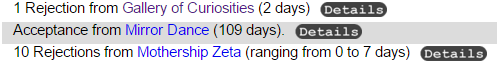
Well, no longer! Now a market only has one line per day to summarize all of its rejections. And the page still shows the same number of lines, so you will often see more total information on that list than before these changes. Acceptances still always get their own line, since those are of special interest, and so if you have chosen to show your name for acceptances you will still see it on the front page. If you ever want to know the more detailed list you can always click the “details” icon to click through to that market page’s recent activity which lists all items from the last 30 days without summarizing.
Remember These Settings (Advanced Search)
On the previous version of the site, the Advanced Search page has had some limited memory of your choices, but I’ve never been entirely satisfied with the method of its operation. In the past it would remember the settings of a few of your choices in the exclusion section by using a cookie. But, this would not persist from device to device, it would only affect a select few parameters, and it would remember any change you made even if you didn’t want it to.
So, the new Advanced Search page has a choice to remember these settings. You pick what values you want saved, you check the box for “remember these settings” and then every time you load the page in the future it will have those same values populated. So, for instance, you can choose whether you want to see fee-based markets in the results, and you could set your minimum pay rate to Pro.
Zoomable Graphs
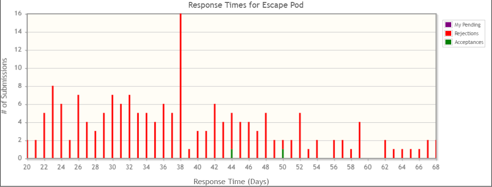
One occasional frustration with the market graphs on the previous version of the site was that if there had been a very long response reported the Turnaround Time graph scale would be very very long and it would be hard to make out much detail in the rest of the graph.
All three graphs are now zoomable, so you can zoom in on particular area of interest, see what specific days were associated with certain values, and etc, so this shouldn’t be a frustration anymore.
Average Response Days in Search Results
The Advanced Search Results and other market results pages now show the average response days for easy comparison of responsiveness.
Sortable Columns
The Advanced Search results and some other pages now can be sorted by in ascending or descending order based on several of the column headings (including the new average response days column).
Delete Piece Option
It was always perhaps a little bit odd that there was no way to delete a piece once you’d made it. Generally the easiest way to work around this had been to just rename the piece the next time you finish a story and use the record for that new piece going forward.
But now you can delete the piece, so you don’t need that option.
Alphabetical Market Listings
Why didn’t the site have alphabetical market listings before? I… really don’t remember. I guess people have usually either knownwhat the exact name of a market was already, or they were searching by attribute rather than name. So no one’s really complained about the lack. Anyway, whether it gets much use or not, it’s available. And it might come in handy if, for instance, you don’t remember how to spell Giganotosaurus.
Exclude Retired Pieces
On the previous version of the site the Manage Pieces page let you filter your list of pieces by checking the “Exclude Accepted” box so you’d only see unsold stories. A new box has been added to “Exclude Retired” (which are simply any pieces that you have marked as retired so they don’t show up in your dropdown list of pieces).
Grinder Favicon
The Submission Grinder site now has a favicon in the form of the site logo. This is what shows up on shortcuts or browser tabs. Might come in handy for spotting at a glance which tabs were Grinder tabs.
These changes look great! I’m particularly happy that I can delete this piece I’ve been wanting to delete forever. Hey, it’s the little things, y’know?
Will it now be possible to change one’s registered email address, I hope?
These features are incredible. You’ve made a tool that helps so many people. Thanks for your hard work. Amazing job!
I’m excited! These are all great features and will present the data in an even more helpful way for rejectomancers. It’s also convinced me to do something I should have been doing all along – logging my pending subs. I’ve tended to just enter them once rejected (or, rarely, accepted). But now that I see how useful the pending sub data can be in the new graphs, I’m going to start doing that regularly.
One thing I wish you could fix – and maybe this is more an issue with my own devices – is keeping users logged in. Even when I check the “Remember Me” option, I have to log into the site every time I visit it. Minor annoyance, but I wish that worked better.
Looks very good –I can imagine how much hard work went into this! Thanks ever much. 🙂